Make a Home Page for Success
The New Year is the perfect time for fresh starts, new beginnings and a brand recognition update. We’re talking about revamping a long forgotten, dormant home page. After all, a home page is a potential client’s first impression of the brand or person they could be working with later on down the road.
Realtors, a successful website and home page can do wonders for your business.

Help! How Do I Make a Website? I Don’t Even Know How to Code HTML
If you don’t know the first thing about coding HTML, don’t worry. You won’t have to worry about that right now. Mashable posted this article in June 2013 on some resources everyone can use to begin building their website. Start there. The websites listed are great for beginners.
The Home pages of the Past
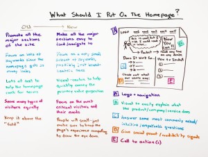
Rand Fishkin from Moz talked about home pages in his first Whiteboard Friday of the New Year last week.
He says that Google is constantly changing and evolving. In the past, it used to be about page rank, keyword density and cramming a bunch of information into the homepage. Now they are much more centralized featuring the most important information up front.
In the past, home pages would rank at the top of the list on search engines because they focused the most on page rank and keyword density. Those tactics resulted in them getting the most traffic, which was the goal. However, that also came with a slew of information for users to read through and digest.
That was okay before, but now users use search engines to funnel them to their destination, meaning they don’t always land right on the home page, rendering all of that information on the homepage unnecessary.
If potential customers don’t like the old way of making home pages, what do they want?
What the People Want
Today, search engines and social media help funnel users to their destination so home pages are evolving into something new.
People want to see them focus on their critical needs.
The Logo/Navigation should remain consistent throughout the site.
Visuals should grab users attention while also telling them what the product does. People don’t like to guess. They want to know what they’re looking at.
Be Transparent. Speaking of answers, it’s good to be up front right away. Answer users’ common questions so they don’t have to spend a lot of time poking around your site for a solution. No one likes to feel frustrated.
Show your Credentials and Testimonials whether they’re from social media or an email correspondence (with the clients’ permission, of course). Just like employers ask for references to call before giving you the job, users want to know that they can trust you before they hire you to do them a service.
Have a Call to Action. Users have landed on your site, they should know what you’re trying to sell them and why, have answers to frequently asked questions, have proof that they can trust you and finally, be able to access a call to action so they can use, install or buy your product.
Here’s a screenshot of Rand’s board:

Www.moz.com ‘s Rand Fishkin’s Jan. 3 Whiteboard Friday: What Should I Put on the Homepage?

Comments are closed